Mint Condition: A New Era of Green Watch Dials
Green watch dials are shifting from forest to mint — and collectors are noticing
There was a time when wearing a green watch meant you were making a statement. Not too long ago, green dials were rare and reserved for the daring or the devout. If you saw one, it was usually dark: olive, khaki, forest, or racing green. You’d find them on Patek’s Aquanaut or the older Rolex Datejust. They were classy, understated, a bit moody. But definitely still safe.
That’s changed. Lately, green has taken a different turn, softer, cooler, more playful. They’ve crept onto dials that once would’ve stuck to black or silver, and instead of being brushed off as novelties, they’ve become the star. This subtle yet impactful shift marks a new era in modern watch design, one where color, emotion, texture, and philosophy are thoughtfully woven together.
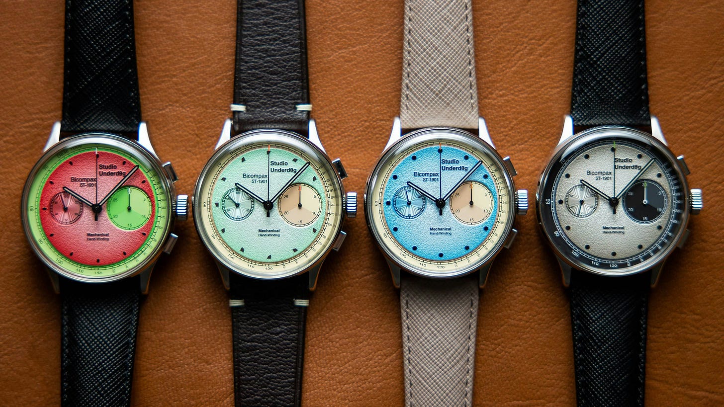
A few indie brands began experimenting with lighter dials, testing pastel hues and less traditional approaches. One of the most fun voices in this color revolution was a tiny British upstart: Studio Underd0g.
Their breakout hit, the Watermelon Chronograph, was half mint green, half pink, with a gradient dial that seemed almost defiant to what the major Swiss players were putting out. And yet... it was a resounding success. Not just because it was fun, but because it was well-made, accessible, and didn’t take itself too seriously. That watch signaled something new: that you could be into horology and still laugh. That collecting didn’t have to be a formal affair.
Studio Underd0g cracked open the door to a new kind of watch ownership: one driven by emotion, color, and personal taste, not just heritage and flexes. It helped reset the tone for what a watch could be: expressive, approachable, and just a little bit ridiculous in the best way.
But while Studio Underd0g made collecting fun again, Grand Seiko reminded the world that color could also be philosophical.
Long known for its textured dials and meticulous craftsmanship, Grand Seiko quietly began releasing 37mm and 38mm exclusives with dial colors drawn from nature. Not in a marketing gimmick way, but in a deeply considered, poetic way tied to Japanese design and seasonal shifts. Dials inspired by early spring skies, mist-covered lakes, blooming sakura. Pale greens that capture a moment, not a moodboard.
Their mint and sage tones aren’t just pretty, but also meditative. A celebration of restraint and observation. It’s not about flash; it’s about feeling. And in doing so, Grand Seiko proved that color can carry meaning.
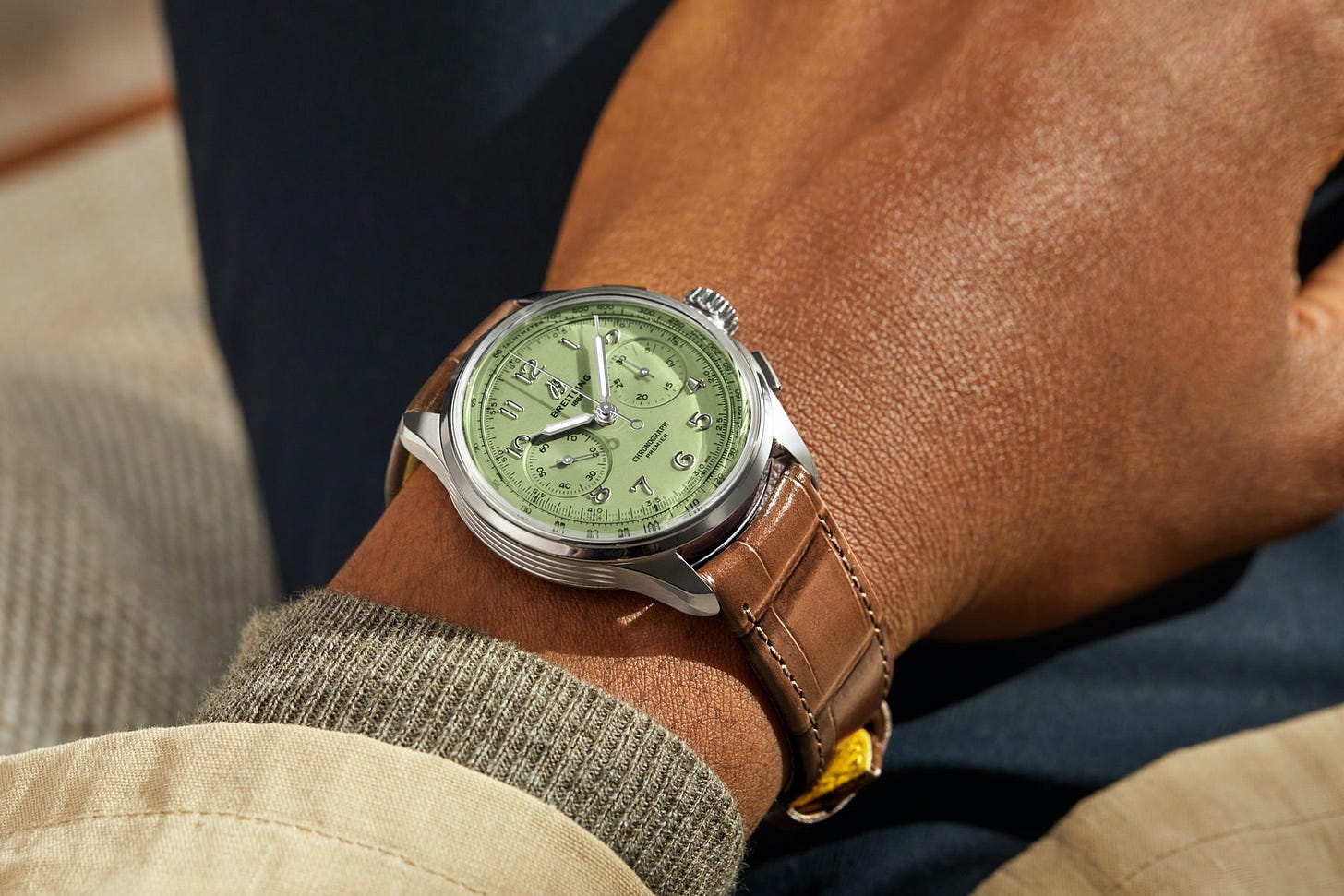
Then came Breitling, with a watch that split the difference between tradition and trend: the Premier B09 Chronograph 40 in pistachio green.
At first glance, the B09 looks like a throwback: classic lines, bi-compax layout, manual movement. But that dial changed the entire vibe. It took what could’ve been a heritage piece and gave it a twist of the unexpected. The color wasn’t loud, but it was confident. Cool. Even a little luxurious in how underplayed it felt. It didn’t feel like a one-off colorway or a seasonal stunt, it felt intentional. And the market responded. Collectors noticed. Waitlists formed. Suddenly, pastel green wasn’t just an indie thing. It was something bigger.
And then, in classic Rolex fashion, came the moment of ultimate validation. At Watches & Wonders 2025, Rolex dropped a fresh wave of Datejusts with pastel-colored dials, including a light mint that was unmistakably a nod to the current mood. As the hype around Tiffany turquoise begins to fade, mint green stands out as a timeless, adaptable choice for any watch or collector.


